Drawing for Architects Basics: Line Weights
Line weight is the visual lightness, darkness, or heaviness of a line within a drawing. In any architectural drawing, from a sketch to a construction drawing, the interplay of different relative line weights is used to communicate depth, importance, and proximity.
THE WEIGHT OF YOUR LINES
Weight refers to the strength, heaviness, or darkness of a line against the background. It can be achieved through different thicknesses, intensities, and sometimes even different patterns - dashes, dots etc. Traditionally, you would generate a heavier line by applying more pressure, or by angling the pencil to produce a thicker line. Today, you can find pens with different nib sizes, and pencils and leads with different hardnesses to aid the process of producing different line weights.
Additionally, all architectural computer-aided design programmes have in-built systems for generating and managing line weights in architectural drawings. These systems range from the simple (closest lines are darkest, further away are lighter) to the highly complex (elements in the drawing have pre-determined line-weights, based on value-decisions make by the architect).
Before jumping in to these more intensive situations, it is important to have a grasp on what line weights mean and how they are read, and what you should consider when incorporating them into your own work.
how do architects use line weights?
There are a number of different situations in which architects use line weight. Line weight is a notational device, and can be used to identify different types of information which are layered in the same drawing. It is used in all drawing types - sketches, sections and elevations, plans, diagrams, perspectives, and details.
Why use different line weights?
To show relationships in time or space.
For example, a dashed line might show an existing portion of a house has been removed, a different stage of construction might be shown lighter, or an element which is underground and can’t really be ‘seen’ might be marked by a lightly dashed ‘hidden line'.
To establish a hierarchy.
Architects select line weights carefully, to bring the viewer's attention to particular parts of the drawing that they identify as important first. Traditionally, the most important information is rendered in the deepest, heaviest line.
Taking this one further step, you might also consider the presence or absence of lines, and what is visible in the drawing. Using different line weights, or at an extreme, erasing elements completely, allows you to edit what should be present and communicated.
To create depth.
Architects are always converting 3-Dimensional spatial ideas into 2-Dimensional drawings. Key to this process is the ability to develop a sense of dimension and depth within a 2-D drawing.
You can use a variety of line weights within a drawing to establish a sense of depth. Darkest line weights come to the front, while lighter, finer lines fall into the background.
To add legibility and clarity to a dense drawing.
When your drawings need to communicate a lot of different and often overlapping information, clarity is key. I have talked about this before in my post on The Keys to a Great Architectural Drawing Set here. Using different line weights allows you to distinguish one type of information from another, and to guide how the eye moves around the drawing - both elements which are key to achieving legibility and clarity.
how to create different line weights:
Think about the density of lines.
Lots of lines close together can give the impression of weight, whereas a single line in a large open space will appear thinner than it actually is.
Manipulate the degree of darkness.
You can do this by pressing harder, or you can use different shades of grey, or even consider introducing colour.
Change the thickness of the line.
As simple as it sounds - make it thicker, draw over it, bunch lines together.
Change the line type.
Rather than a continuous line, you can use a range or other line types, from equal spaced dashed lines to centre lines and cross hatched lines to indicate different elements or hidden elements.
Three clues to using Lineweights:
Variety, Consistency, and Intuitiveness
The number one rule is to use a variety of different line weights.
4 is probably a good starting point. As you add additional elements or items of information to the drawing, consider whether you can make them to look the same as existing lines, or whether this would cause confusion. If so, you can add more line weights, change the darkness or colour, or look at changing the line type to a dash or something similar to differentiate.But more importantly, whatever rule you are following - be consistent!
There is nothing more confusing than line weights which change rules in different parts of the drawing, or within a drawing set. Once you have a system in place, be sure to stick to it - or if something needs to be changed, change it everywhere.Your system should be intuitive.
Not least, so you aren’t continuously having to look up rules in order to draw! The plus side of this is that the more intuitive it is to you when you are drawing, the more intuitive it will be to whoever is viewing the drawing and trying to make sense of it later.
How to use different line weights
in your drawings:
Proximity
Here, the typical rule is the closer the object, the darker the line; the further away, the lighter the line. This is because read thicker, heavier lines as being closest to us, whereas lighter lines recede into the background. This is particularly important for making sense of perspective drawings, and for giving depth to 2D orthographic drawings - in particular Elevations and Section where space is flattened.
Importance & Hierarchy
Heavier, darker lines suggest more importance, so you need to be selective about what information you are showing in your drawings, and the line weights you attribute to different elements. This is a personal decision making process which can vary from drawing to drawing.
For example, you might draw construction lines and guides to help you set up the drawing and get other lines in the right place. While they are important for you while drawing, these lines are often not important for others to see, so were traditionally drawn very very lightly, and often erased later.
But there are no hard and fast rules here - you need to be selective about what is appropriate and important to help you communicate your project. Often at concept sketch design level, or in University project, you might choose to keep or even enhance these lines to communicate the process and add texture and atmosphere to your drawings.
Materiality
Depending on the scale of the drawing, you may show more or less information about the specific elements and materials which make up a wall. Sometimes you may give no indication of materials at all, and adopt an outline-only style, or infill walls and other elements with poche.
Sometimes, it is useful or even necessary to indicate materials using a variety of lines in your drawings. Generally, a light material is given a lighter line weight, and heavier materials are given heavier line weights. It makes more visual sense to draw stone with a heavier lightweight than you would the fabric curtains.
Cut
Architects use a number of drawings which rely on 'cuts' to reveal things we would not normally see. The standard rule is that anything that is cut through to produce the drawing will be a very heavy line weight.
For example, a Section Drawing is produced by taking a cut through the building. Any element that is sliced through is this process will be darkest or heaviest. What is visible in the room beyond or on a distant will will be much lighter. A Plan is also a cut, so the elements which are cut, usually walls, will typically be darkest.
This rule is also moderated by the idea of Materiality above. Where you choose to show each of the different elements that make up a wall (the wall 'build-up'), you would consider the appropriate line weight for each of these individually. It is the density of these lines, located closely together on the page, which gives the weight to the wall as a whole.
Outlines, edges and surfaces
This rule comes into play when drawing 3-dimensional forms in axonometric, isometric or perspective.
The 'outline' or 'silhouette' of an object - where the object ends and the space around it begins - are typically treated with the darkest lines. Mid-weight lines are used for other edges, which denote a change in plane, but aren't set against the background. Light-weight lines are used for any detail, texture, or elements which are embedded within or on the surfaces of the planes.
Scale
Remember that line weights are most useful when a variety are used in relation to each other. This is related to scale. As you zoom in to parts of a project, you should manage the relative line weights within the drawing.
For example, in a 1:200 plan, a pane of glass might be demarcated by a single, light-weight line. At 1:50 scale, the glass might be two mid-weight lines, and at 1:5, 12 light-weight lines, with a mid-weight line on either outside edge.
In case you missed it above, I have put together a Guide to Using Line Weights in architecture projects covering the basic rules. Click on the button above to download your copy.
You can use it as a starting point for each drawing, to ensure you are setting yourself up to produce a detailed but legible drawing with depth and clear hierarchy. There is space on the PDF to note different line weights as a kind of key for your personal reference, if you want.
The PDF also includes a checklist, so that when you think you are nearly done, you can run through a series of questions to make sure the drawing is working the way you want it to say. I still use a number of these questions today in practice - getting a drawing reading correctly is an art, and requires continuous re-crafting!
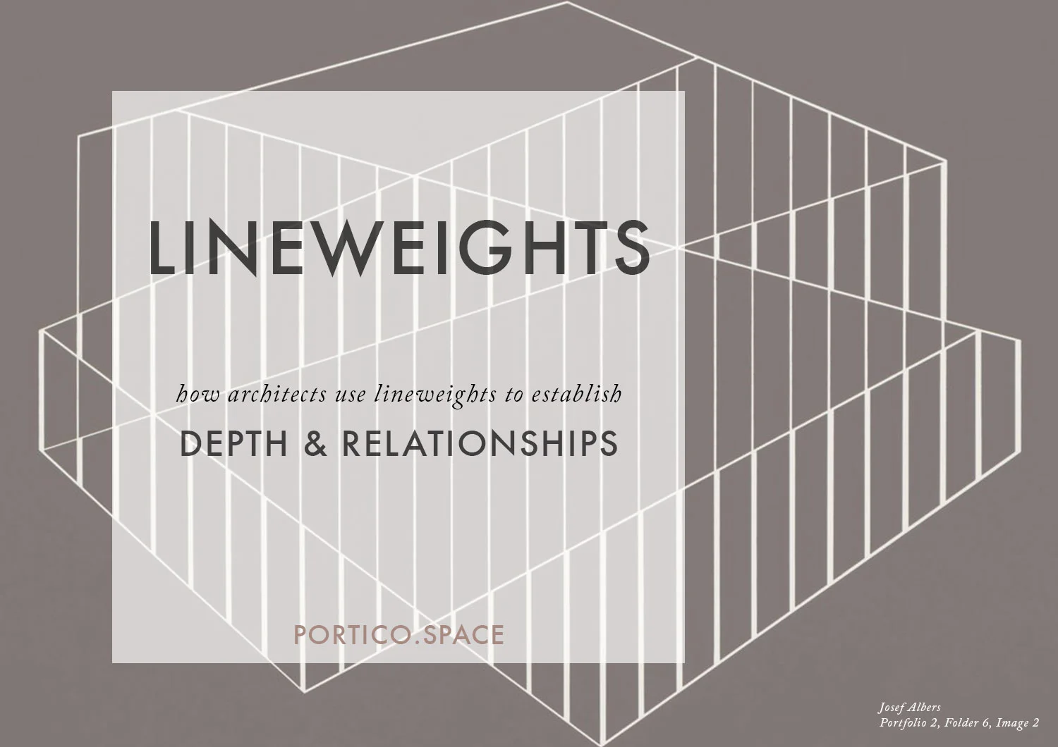
Josef Albers
The image used in the main post graphic above, and the one to the right, are both artworks by German-born American Artist Josef Albers (1888-1976).
Although most celebrated for his work with colour and form, which influenced the artistic practices of colour-field painting, abstract impressionism and minimalism, his work with line is equally valuable, perhaps especially for architects.
Albers established his legacy through teaching at the Bauhaus, Black Mountain College and Yale University, where a number of prominent artists and architects studied under him.